Gwen started us off, her subject was India, her colour green and she had to use Tyvek and puff paint in her piece of work. This exercise was intended to take us all out of our comfort zones and it certainly managed that for most of us. Gwen dislikes the colour green but has made an amazing piece of work, which is still evolving. Gwen introduced Tyvek in it's fabric form, on the elephant and although it can't be seen it forms the underneath layer in the lower part of the design. I hope I am correct in saying the hair detail on the mask which Gwen made, is styled using puff paint. (Apologies Gwen if my memory of your description is incorrect!)


My own subject was Stones, my colour was blue and I had to use felt and Angelina somewhere in the piece. Having spent very many years of my life in blue school uniform then having to wear blue suits and skirts in my job in John Lewis I really avoid the colour in my work. However, having done some research into the colour as part of this project, I realise just how many different blues there are and the history of the colour has proved very interesting, changing the way I now look at it. I now intend using it more often in future work. I chose to make a multi-sided vessel, working in a grey woolen fabric, both represent the granite of the Jelling RuneStone I chose as my subject. I introduced blue in the silk interior lining; felt was used for the appliqued image found on the larger of the two Jelling Stones, this was needle-felted to the background and I introduced Angelina in the text on the vessel lid interior.


Gill whose subject was Birds, had to use black as her colour, and introduce Anglelina into the piece.
The three bird motifs in Gill's mounted panel wall hanging were inspired from a Peruvian textile as were the tree shapes. Gill introduced Angelina in the bird wings and used paper to give texture to the background of her piece. This challenge took Gill well out of her comfort zone, discovering that she really does not enjoy this type of work, and it has only re-enforced her preference for abstract design.


Yvonne whose subject was Art Nouveau, her colour to use was purple and she had to introduce transfer paints and soluble fabric into her piece of work, likes to work in a theme and produced three pieces. Yvonne sampled her techniques by making a small wall hanging before moving on to her main project, then decided she would make a bag using the same theme. Yvonne introduced transfer paint into several of the applique shapes in the wall hangings, and used soluble film to make the embroidered corner additions to the main piece and the joining elements in the smaller wall hanging.


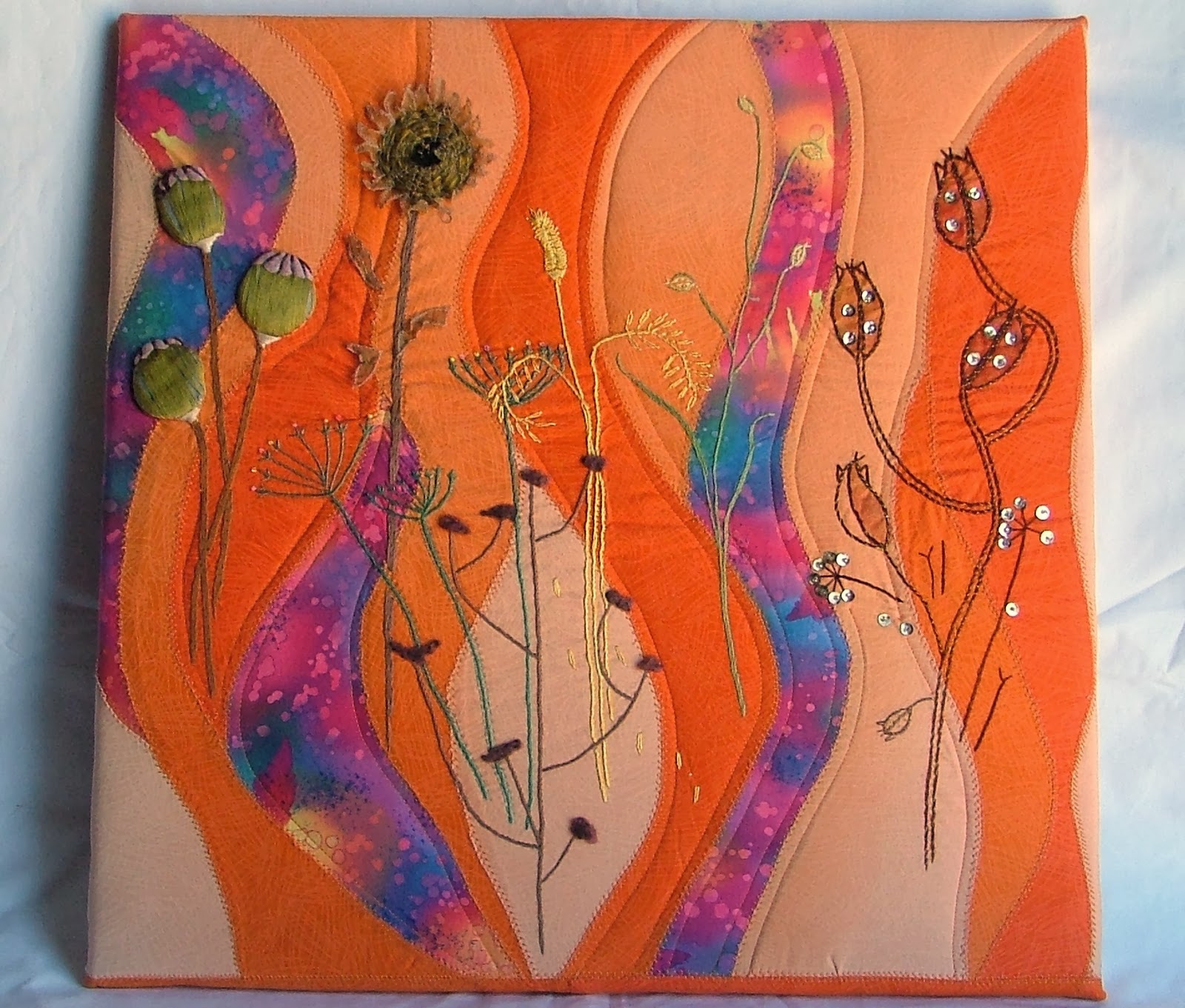
Jill made a mounted wall hanging for her piece in this project. Seed heads was Jill's subject using the colour orange, and soluble fabric and transfer paints had to be used somewhere in the work. Jill was delighted to find that her favourite colour purple worked with orange and introduced some of this colour in strips on the background of her work. She collected seeds during her many walks in the "campo" around her home, and began to choose which ones she would introduce in the work. Jill described many of the seed heads using embroidery in one form or another and used soluble film when working the sunflower and introduced transfer paint to the leaf shapes before appliqueing them to the piece.

Jenny who like Yvonne always works in a theme, produced several pieces in her theme of Architecture. Jenny had to work with the colour red, and use foil and Lutrador somewhere in the work. Jenny's passion is digitizing her own embroidery designs so she worked her pieces using this process. Jenny has decided she definitely doesn't like working with Lutrador (it doesn't hold it's shape well enough for her purposes) except as a base for her embroidery maybe! Jenny made two vessels in Lutrador which she uses as candle shades, which when the candles are lit, enhances their translucent properties. As a final piece Jenny went on to make an enclosed vessel using the Alhambra Palace as a design source for the layers on the vessel which are made using Lutrador to embroider on, then distressed them with heat to get the effect she wanted. Jenny used the smallest amount of foil she could in the center of the embroidered motifs on the tall red openwork vessel.


Ann, who has been under the weather for much of the year, talked us through samples and research photos for her subject reflections, using the colour brown which she detested until she researched it and discovered just how warm and rich the colour could be. Ann is to use paper and embroidery in her work. Originally Ann intended making a large vessel using hand made paper, with various images of reflections in the interior of the vessel. She changed her mind midway and is now working on an embroidered piece and will show us more of the work as it progresses. We look forward to seeing the finished piece Ann.
Many more photos and information about each member's piece of work will be available to look at on the Viñuela Sew and Sews website in the near future.
After this really interesting morning of show and tell, we had lunch before then discussing our next Group project "the Journey", which we are all really quite excited about, but you'll have to wait and see what we come up with!
Rachel